
An old fruit crate rehab (and a color test)
When my sister-in-law and I were cleaning out the abandoned house, I found an old fruit crate that was full of books.

Until I took the books out, I didn't even realize that the bottom was barely holding together!

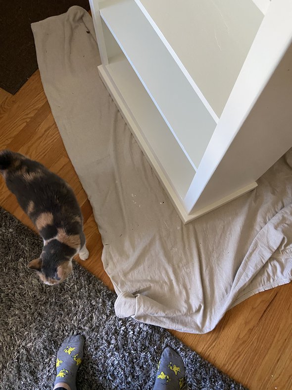
I never did get around to rehabbing this one during last summer's painting spree, but since I have some time this semester, I decided to clean it up.
I brought it over to my dad's garage at the same time as I brought my scuffed table, and I asked if he might have some scrap wood available to make a new bottom for the crate.

And of course, he did! My dad has a lot of scrap wood in his garage attic, and he is quite prone to saving wood for reuse purposes.

So, once I got it back from him, I sanded it all down.

Then I primed it, using my Zinnser 1-2-3 primer (which I always use on my painting projects!).


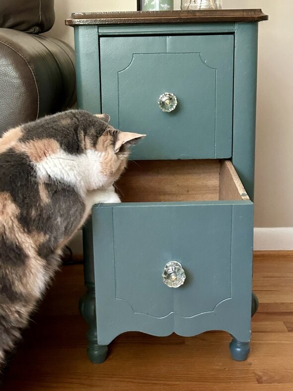
Part of the reason I wanted to paint this crate was so that I could test a paint color on it before tackling my scuffed side table.
So, I got a quart of Mythic from Benjamin Moore. The employee told me it was a little iffy to try to make this color in the Advance paint I love, but that he could get very close.
And I said, "Oh, ok, close is fine."
But oh my word, the color didn't turn out at ALL like I was hoping.

It was a very light lavender, which is not a horrible color, but man, it is not what I wanted. I was going for a super moody purple, thank you very much.

I went back to the paint store and the girl behind the counter tried so hard to darken this paint but it would not darken, no matter how much black she added.

At a certain point, you can't keep adding colorant because then the paint won't dry at all. So we eventually gave up and I just picked a new color (Benjamin Moore Almost Black).

Interestingly, this color is definitely giving the Very Dark Purple energy that I was going for with the Mythic color in the first place.

Butttt now I'm questioning myself. Do I like this color enough to use it on the scuffed table? I mean, it's fine for the crate; I'll just leave it with this shade.

This color is sort of hard to photograph; it's slightly darker than it's appearing in most of these photos.


I'm kind of invested in making this $5 scuffed table look really good, though, so maybe I'm overthinking it!

I was thinking about maybe staining the top and painting everything below, but I am trying to figure out if I think this color is dark enough/neutral enough.
So, give me your opinions!
Also: I haven't decided for sure what I want to use the crate for, but I think I might use it as a handy place to toss winter gear.

P.S. EVERY TIME I try to branch out from my usual black/white furniture, I start to regret it. Color is way harder than neutrals!
I quite like the last/darkest crate color and think it would work splendidly for your little side table, especially with a stained top. Believe it or not, our bottom kitchen cabinets are almost that same color and look great with the faux wood vinyl floor we put in. (Our cabinets were that color when we bought the house, and we wisely chose to leave them be—if it ain’t broke!) I can snap a photo to send you if that would help you decide!
I am the worst at decisions involving color/decorating but I look forward to seeing the suggests of others and the final decision and finished product.
I'm not into gray/black for interior colors, so I'll refrain from comment on that one.
But! I do have to comment on your dad daving scrap wood. My dad also has a pretty extensive wood shop (with scraps), but he didn't have one at all until my parents built the house they live in now. He did, however, have a wood collection. He has collected wood from every place they have ever lived, which, since he was in the Air Force, was a LOT of places. My mother could never understand how it was worth it to pack and move heavy blocks of wood every few years when he wasn't even doing anything with them. It's a running joke in my family about how if you're on a hike with him, you'd better hope he doesn't spot a burl, because you'll be hauling it back to the car. (This has happened to my mother numerous times.)
All this to say, I think your dad and my dad are cut from the same cloth. Or rather, block of wood, I suppose.
@kristin @ going country, I can't imagine moving every few years with a lot of scrap wood. Even if the DoD were paying for it, I'd hate the hassle. No matter how pretty a burl is.
@WilliamB, My mother hated it, too. But I suppose this is one of those examples of indulgence in a long-term relationship. 🙂
@WilliamB, A burl is gorgeous! The museum in which I worked sometimes featured works in wood alongside the fine art paintings since we live in an area of nationally-renowned woodworkers.
@Erika JS, Agreed! But something tells me not all the wood was burls.
I say go with it - its a very interesting color, and after all, its just paint. Which can be painted over, you know...I like the idea of the stained wood top and painted bottom, though!
Can you post a pix of where you're going to put the table? That'll make a difference in how it'll look.
Picking out colors is so hard! I like the idea of a stained top and painted bottom for the table, but I think a different color on the bottom of the table would "pop" more.
Before I'd read to where you mentioned it, I thought stain the top and paint the bottom. I think that will look good. As to the paint color . . . if this color you are using goes with other items in your home, I'd stick with it.
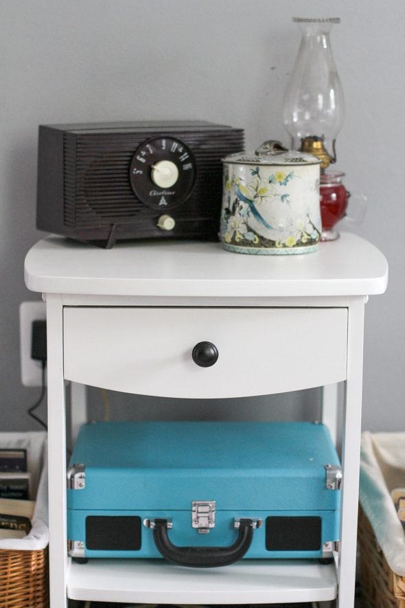
Wait, you don't regret your dining table color or the Philco table color, do you? I love them!
It's hard for me to say, since my computer color is not your real life color, and the changes in your lighting will affect the color, too. I might suggest living with the crate for a while longer to see what you think of that color before painting the table. With a stained top, I think my personal preference would be a shade of slate blue, but blue is one of my very favorite colors so I'm prejudiced in its favor. My other thought would be to match it to your dining table.
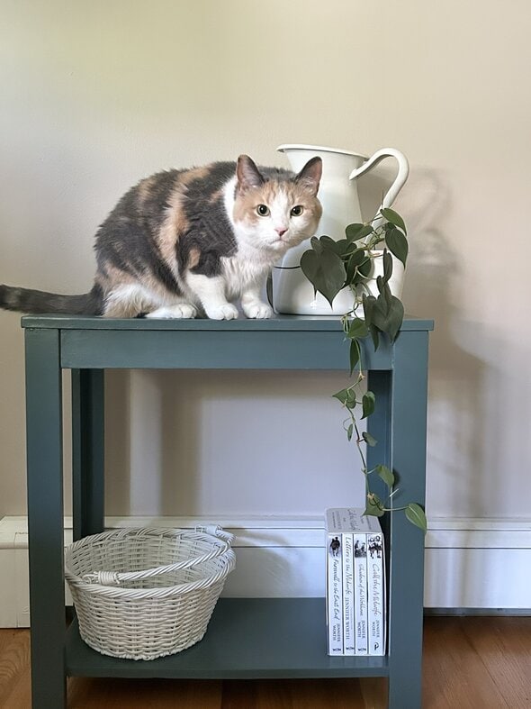
Good save on the crate, though. It seems perfect as a catchall by the door or a box to hold newspapers and magazines (assuming you even have those). On the other hand, your cat may make the decision for you by taking over the box.
Purple. Like grapes. But then I love color. Also I'd put an offcut of stone on top of the scuffed table--go to a stone yard and see what scraps they have.
@Rose, ooh, fun idea!
I think the side table would look nice in cherry red.
@Becca, I thought, too, that red would add a nice splash of color.
Stain the top and use this new paint. Go for it. I like the moody purple.
Being an old-fashioned type, I probably would have left the wood au naturel after the sanding. But, along with everyone else, I look forward to seeing the finished product. And you may have inspired me to do something with the two old fruit crates I've got sitting in the basement.
@A. Marie, Same here. I kind of winced seeing the box lose its original paper label.
@Battra92,
Me too! It was probably an old citrus box and I wondered where in Florida it was from. Perhaps Steinhatchee? It makes me nostalgic for the day when citrus trees were everywhere and the spring blooms were intoxicating.
I love the color you chose, but I do not care for it next to the brown. If you want to stay with gray, I would go with more blue undertones. BM’s Gentleman’s Gray or Gray Timber Wolf.
Of course, you could do almost any color at all. You should do what makes your heart happy!
@Battra92,
me too! Thought it was so pretty and original
@Battra92, I was sad to see the label go, too, and for myself prefer stained wood to painted. OTOH I'm not sure how I would have saved the label, given all the work that the box needed.
Yeah, I don't know how I'd have saved it! It was so ripped and worn.
@WilliamB, Just leaving it is how I would've dealt with it. Plenty of new wood boxes out there.
Unfortunately, everything from that house smells so bad, it's gotta be sanded down. Everything has a musty, cigarette-smoke scent. (odor might be the better word!!)
@Bee, - We scallop in Steinhatchee! We live about 1 hour 45 minutes from there.
@Bee,
To the best of my knowledge, Steinhatchee is and always has been a fishing village. I've never known of any groves there. (I live about 40 minutes from Steinhatchee). Citrus does grow around here, but it's risky to count on it - a winter like this last one could wipe a stand of citrus out or set it back a great deal. Oh, I just studied the crate, and down in the lower right, it says Wenatchee. There are a lot of "-chee" names in Florida!
@Kris - Steinhatchee loves its scallopers! I would recommend the Fiddler Crab Festival sometime. It's in February.
For the non-Floridians, that town is pronounced STEEN - hatchee. I know, it looks as if it's pronounced "stine."
@JD, Wenatchee, Washington is well-known for apples in the Pacific Northwest!
@kris, you may not live too far from me. Steinhatchee has great scalloping.
@Battra92, yes! That label was SO cool! Saving that classic, vintage label somehow was what I was hoping for. FYI, I could have sold that crate, as was, for $20-$50!
I kind of like the grey-purple, but it all depends on your plans for where it’s going to go. Your projects are inspiring- but if you find old fruit/veg crates, don’t paint over them, even if they seem in bad condition!
@Battra92,
Same here! I love those old labels.
Go a dark navy. Always classy. gold or bronze accents.
It's hard to tell from photos how those two colors go together, but I would try the darker color on the bottom of the table and the lighter one on the top. The other thought is the darker color on the bottom and a slightly gray stain on the top, almost like a whitewash, but grayish.
I liked the old crate sans paint, but I know that isn't everyone's vibe. Like WilliamB said, where you place the table has a lot of bearing on the color. Will it be in the same living area as the crate? Repeating the color in the same space will bring cohesion to the area. I like the idea of a mix of stain and color for the table, and I think that if you found one or two other small items to paint (maybe one of your terra cotta pots on your shelf?), it would look intentional. Have fun!
@Kris,
I agree that repeating the color will work well (paint some flower pots as well?)
A Dutch stylist whose blog I regularly read, says that any color with enough black mixed in, can function as a neutral by the way.
@J NL, what stylist is that? I read myscandinavianhome.com regularly. She has a great variety of styles represented and it's nice to see something different from what US stylists offer. And yes, I was thinking that painting flower pots or bookends or other smaller items would be a good way to spread the color around without being overwhelming. It looks like Kristen has a throw in the purple crate which is a pretty close match, but it's hard to tell. 🙂
@Kris,
I mean Lida Thiry. She is a clothes stylist, but used to be an art teacher . She blogs about fashion and color trends, but also and more often about getting to know your own shape, making use of the rule of thirds and the golden ratio, adjusting clothes to fit your body shape instead of the other way around, getting to know colours (what turns a colour in a pastel, tone, hue, neutral that will work well for you), and finally: know your own personality.
I am thinking that if you know your personality and the colours and styles that suit you, you can apply that also to your home. It is no use including a lot of romantic or bohemian or dramatic style elements in your home when you are a classic or natural personality for instance. For that reason I think the responses from the readers are very revealing!
@J NL, thanks for your reply. So interesting!
It’s good to go outside your comfort zone and try new colors. While I wouldn’t like a whole house full of dark painted furniture, I really enjoy the storage box color. The beauty of paint is being able to change it easily if you change your mind or decor!’
It's a pity the old fashioned label, with the Indian chief, wasn't intact. That would be a really neat thing to preserve! But, except for the bottom, that wood looked good and sturdy. My dad (born in 1920) once told me that yesterday's scrap wood was better than the wood they sell today as premium A-1 stuff. I'm sure your crate-turned-storage-box will last you for many decades to come.
@Fru-gal Lisa, My husband does wood working and he says the same thing as your dad and he was born in 1948. Not sure when the quality changed.
I was curious about the remnant of the label, as I live near Wenatchee, Washington. Found this: https://thelabelman.com/products/copy-of-wenatchee-chief-brand-vintage-washington-apple-crate-label-b
Love that it made it to your part of the world!
@Deane,
The label in its pristine state is so cool! I would have to buy one, and adhere it to the crate after painting/refinishing, etc. I realize that's not everyone's vibe, but I like a vintage/eclectic look.
I’m interested in the books that were in the crate. I just love books, but they also could help flesh out the mystery occupant. Were they popular fiction from a certain decade? Old college texts? However, I guess not too important to the owner if stashed in an old crate.
Kristen,
You could paint most of the table in a neutral but use a moody purple on the drawers or just on the top.
Rebekah
Loughts of thoughts/Lots of thots (sorry, ridiculous, NO MORE CAFFEINE FOR YOU, YOUNG LADY!)
1. Decorating with white, black, brown, beige, and gray bores me something fierce.
2. It almost causes me physical pain to cover natural wood with paint.
3. In a room full of those boring colors listed in #1, a pop of any version of red seems to be the right answer. This is coming from someone who usually believes that blue is the answer to most decorating questions. Which leads me to another thought. . .
4.. . . turquoise would look marvelous among all those neutrals!*
5. Paint can always be covered with more paint.
6. Paint stores often have trouble mixing just a quart, and once there is too much white, there isn't enough room in the can to add the necessary pigments for darkening.
7. I haven't heard about too much colorant causing a drying problem; interesting!
Aren't you blown away by all the options and opinions? It just comes down to the fact that taste is an individual matter.
*It seems that yellow or orange are currently the trendiest accent colors with neutrals.
@Central Calif. Artist, laughing over your first line 😀
@Karen., thank you. It gets lonely laughing at myself sometimes.
I LOVE that color. I am a huge color enthusiast (talk to me about my deep emerald hallway, marigold bathroom and teal dresser), so I say go for it. That purple looks pretty neutral-cool depending on the light. I would just make sure whatever wood stain you choose swings the same way.
Also....it has been literally proven that the world is losing color as everything goes to some shade of netural.
BRING BACK THE COLOR!!!!!
I will get off my soapbox. (But really paint it whatever sparks your joy)
@Heather,
What color is your soapbox, may I ask? 😉
@Heather,
Jumping on the soapbox with you, Heather! Although, I know that my soapbox is definitely turquoise. ☺
I agree with staining the top and then painting the bottom part. Personally, I liked the navy/dark blue suggestion - some color, some personality but not too over the top. The moody purple would go well with your dining table, though, so if it's in the vicinity, that sounds like a solid plan too. Good luck!
why do I see this side table being red?? Don't know, it just came up to me...
For $5 you have nothing to loose if you hate the color. Respectfully, I think you are overthinking it. And a pop of color here and there, nice way to enliven black/white.
The color looks great in the photos even if it isn't accurate. It also looks great next to the black sofa.
Whatever you decide, it's a small investment. Heck, we spend more than that when we try new recipes around here! (I think of that as "investing" in culinary expoloration!
@Irena, Only $5 but how much of an effort investment? The effort part of it makes me want a project to work just as much of the dollars put in and clearly Kristen has invested some skilled effort here!
I think the last color would work fine, but would be much more effective if you can add some accents in the room with that same/nearly same color. You could even use the leftover paint and paint a basket, wooden bookends, etc.
Better idea - instead of using that purple as an accent, choose a color that is its opposite on the color wheel. Can be a small item. Will make the room pop.
@Kathy L, I immediately thought of a neutralish-minty-lime which is the Photoshop inverse of eggplant.
Or just favorite color. In a room of neutrals, everything is a possibility.
All that to say, Kristen, we will all be interested in what you decide. Evidently. lol.
I don't think this is the color. It's a fine color. There's nothing innately wrong with it. But I think it is not the interesting pop of color you were really talking about. 🙂 I say invest in another can for that really interesting "different" color piece! Although, if you stain the top and then paint the rest I do think that would add to the interest part. I'm still in favor of a new color. 🙂 Also, I'm not very good at interior design!
I think you should just go for it! After all it is a *small* piece of furniture.
Try Sherwin Williams Iron Ore. It was recommended to us by our Realtor's decorator, and it looks good on our front door. Kind of a grayish black with some purple and blueish undertones.
Iron Ore is a good black. My absolute favorite black is also by Sherwin Williams, it’s Tricorn Black. It is a black/blue with tons of depth.
@Leigh,
I see SW's Tricorn Black used frequently in homes that make it to the pages of Better Homes & Gardens. I love it, but am too chicken to use it in my (open plan) home.
Love the color and love the idea of staining the top, perhaps to match the other table you refinished.
I have no opinion as I once had this great idea of painting our house arctic orange...a few days later several men came by from a nearby church and offered to repaint it for us. (This was years ago, before I married, and my roommate and I had purchased a house together. She, too, liked vivid colors. Apparently, together we were a blight on the neighborhood.) I continue to be impressed at your rehab projects. I honestly would not have seen the potential in either item you saved.
I'm from a place that was famous for its citrus. You can find inexpensive repro labels pretty easily on Amazon or Etsy.
Personally, I don't like the purple. I think navy might be really nice, or teal. If it were me, I'd probably try to leave the top natural (like the dining room table you painted) and make the bottom pop. You asked for opinions so I'm not trying to be negative! If purple is your favorite color, I'd say go for it. If purple isn't your favorite color, you might tire of it quickly.
I have a fear of neutral colors. We have a green bookcase and yellow chairs. I also live on a very colorful island.
Your apple box label was Wenatchee Chief, Wenatchee Wenoka Growers Assn., Washington. Very cool.
Ooh! Put wheels on the bottom of the crate! It would be so convenient!
I like the shade. Maybe try a little after you get the table top stained. I think a little more purple would givetge table a fun look. I love indigo blue just by the way!♥️
Love that you salvaged the old crate! I'm in a blue phase and was thinking that crate would look amazing in a navy blue - add brushed gold drawer pulls on the sides to give it a bit of bling and provide handles for easy lifting/carrying. But that's my taste. You go with whatever color feels like home to you. I would definitely add handles to the crate, and paint the table to match with matching hardware. Can't wait to see the final results!
Yes, reluctance to choose colors is one of the reasons I’ve put off a large painting project. Notice I said ONE OF.
I like the moody purple box. And I see it with casters on it! I think they would make it even better and more useful.
The purple would be nice for the table, or maybe the same blue as your dining table. I like what someone said about matching it with a couple of other items to make it look intentional.
I don’t think this color is right for the table, but it is a cute accent color for the crate. Are there felt or rubber feet under the crate to protect your wood floors? I like the idea of staining the top of the table a rich stain if you paint the base of it black or something… maybe a dark gray, or off white or taupe but if you stain the top and paint the bottom some color-color, it will be too busy. It’s expensive, but Annie Sloan Chalk Paint is perfect for this application; the Old White color for the base would make it look very antique, then you varnish it (or wax it), and you could stain the top as you said.
The saga of the scuffed table... I would consider staining the top dark to match the legs - they look pretty dark and then maybe a mushroom or mouse color for the body of the cabinet. Very trendy colors at the moment, but they look great next to nearly any color of wood, and depending on the undertone of the paint could be complementary to the purples that you already have.