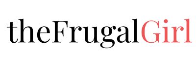
I have a new header!
Isn't it beautiful??? My friend Kristen (I really do have a friend named Kristen), who blogs at Knitting Kninja designed this for me, and I am SO happy! No more boring black header for the frugal girl. No siree.
My friend Kristen is very artistically gifted in ways that I am not...she can draw, paint, do graphic design, and she also is an obsessive knitter. Oooh, and she is a really wonderful writer too. And though I've never had the privilege of meeting her in person, I count her as a good friend (and I did even before she made me this header, in case you're wondering! 😉 )
Anyhoo, my blog is looking much more cheerful now(if you only read my blog through the email feed,you should come to my blog and see!), and I am forever indebted to you, Kristen! Thank you!
By the way, Kristen is available for hire, so if any of you would like to snag some graphic design help, you can email her. Her email is: knittingkninja {at} gmail {dot} com.

It looks great!
Oooh, I'm one of those that read through just the feed so I don't have the pleasure of knowing what the old header looked like, but I really like the new one! It's got a clipped coupon motif going on 😀
Oh that's lovely - really clean with a bit of girly pink on it. It looks fab; you must be over the moon 🙂
Nice! Congrats!
Oh I love it. I love how simple it is. Very Cute!
Lookin' good.
Looks good! I agree, definitely a nice shot of color
Very nice. Some people are SO creative.
All I see on my Mac/OSX/Mozilla combo is a box that shades from black to gray, with very small boxes of lighter black to gray.
I love it!! It's nice and simple. I love that it looks like a coupon!
Love it!
Very cute! Love the scotch tape!
It's lovely and artistic
BTW, your come and see "the site" site link doesn't show up correctly. It's giving me this URL:
https://www.thefrugalgirl.com/www.thefrugalgirl.com